Rick Meyerowitz, a king of the land where art and wit meet, has been way busy lately. Feeling that no truly definitive tribute to the National Lampoon existed, he decided to do one himself. So, after years of work, we now have the beautiful 300 page Drunk Stoned Brilliant Dead: The Writers and Artists Who Made the Lampoon Insanely Great .

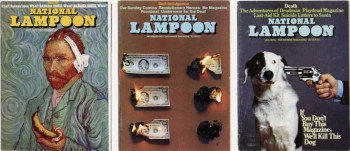
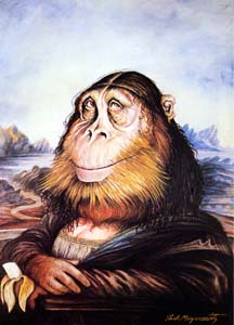
In it he lovingly pays tribute to the writers and artists of that great mag and the sensibility that made it possible. This is a major event, a bright spotlight for once on a kind of humor (hip, literate, political, sexy, sick) in print that may have reached its peak with the Nat Lamp. Rick was the signature artist of the Lampoon, doing some of its most famous images. But that doesn’t prepare you for the insight and skill with which he compiled this work. An appreciation by Steve Heller below from The Daily Heller.
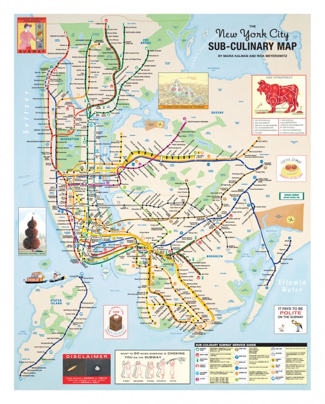
Also tonight he and Maira Kalman unveil their latest New Yorker map at “You Are Here → Mapping the Psychogeography of New York City,” an exhibition of work by a selection of contemporary artists that will map the emotional terrain of the world’s most famous and influential urban center, New York City, and explore the effect of the city’s powerful moods on those who live and work here. “You Are Here” will run from September 24 through November 6, 2010, and will be celebrated with an opening reception on Thursday, September 23 from 6–8 PM. The exhibition and opening reception are free and open to the public.
Pratt Manhattan Gallery
144 West 14th Street, 2nd Floor
(212) 647-7778
Gallery Hours: Tuesday–Saturday 11 a.m. to 6 p.m.
“Making people laugh is the lowest form of humor,” said Michael O’Donoghue, one of the wits behind The National Lampoon (and a substitute English teacher at my high school). But making people laugh hysterically was the goal and success of The National Lampoon, which picked up where MAD magazine left off.
What would I have given to become the art director of The National Lampoon? My left arm? My right knee? My pinky toe? Yes, yes, and yes. I would have slashed these and more essential body parts off just to land the best art direction job a poor boy from Stuyvesant Town in the backwaters of Manhattan could hope to get. I so loved the Lampoon when I first saw it – at least the concept – that it became my dream job. From the first issue, designed by Cloud Studios, I was confident I could do better – much, much, much better. In fact, I was already doing Lampoon-like things for underground newspapers, so I figured I was a shoe-in, if only I could get my shoe in the door.
It was not, however, ever to be. By the time I received my Doctor Martins, Cloud was out and Michael Gross was in. His art direction was cleaner and tighter than the previous anarchy, and his typography combined with visual acuity enabled the Lampoon spirit of parody to shine. Yet under his reign I longingly wanted even more to be hired by the Lampoon (in whatever high ranking design position I could get). So I did what any red blooded, ambitious, go-getter would do. I tried to copy it in other publications I was working on.
I became art director of Screw magazine, which published an offshoot zany rag called Mobster Times (subtitled “Crime Does Pay”). It was just before Watergate blew the top off President Richard Nixon’s administration. I tried so hard to make MT in the mold of NL. But lo and behold, I didn’t have the lightness of touch that Gross had. My hand was heavy, my type was crass, my attempts lacked nuance.
Nonetheless, every year for three years I took my portfolio up to the Lampoon anyway, where I was pleasantly rejected with one of those great “we have your telephone number” responses. Instead, I was hired as art director of the New York Times Op-Ed page – and the Times is where I remained for almost 33 years. Still, I often have a recurring dream that I was art director of the Lampoon after all – and with all my appendages intact.
Watch for Lampoon events in Los Angeles and New York.

